Bold
Turns headlines into the interface — stark contrast, massive type, zero timidity.
- Version
- v1.0.0 · Updated Jul 18, 2026
- Context
- ≈2,748 tokens
- Security
- ✓ scanned
- License
- Single seat
- Works with
- Claude Code, Cursor, Codex
Checkout opens soon · launches at $9
≈2,748 tokens · v1.0.0
Live demo — an original page built in the Bold style. Open in new tab
About this skill
A high-impact design system featuring strong typography, stark contrasts, and unapologetic visual elements. Its live demo renders an agency portfolio — hero, selected-work grid, services, and contact CTA.
The skill file
Bold is a design system that treats restraint as the enemy. It leans on enormous display type, uncompromising black-on-white contrast, hard-edged geometry, and a tight palette of saturated primaries used as punctuation rather than decoration. Reach for Bold when the goal is to grab attention in the first half-second — launches, manifestos, campaign pages, and brands that would rather be remembered than be polite.
Design principles
- Make type the hero: headlines should feel almost too large, never timid — when in doubt, go a size bigger.
- Contrast over nuance — pure black
#0A0A0Aagainst pure white#FFFFFFis the default relationship; mid-grays are the exception, not the rule. - Color is a weapon, not wallpaper: deploy red, yellow, or blue in solid blocks, never gradients, and never more than two accent hues on one screen.
- Edges are sharp. Zero corner radius everywhere; let rectangles be rectangles and let images crop hard.
- Shadows are graphic, not atmospheric — hard offsets that read as drawn outlines, like a sticker peeling off the page.
- Negative space is structural; a single idea per screen region with generous breathing room so the loud parts can shout.
- Commit fully — a half-bold layout reads as a mistake. Every choice should feel deliberate and confident.
Color
The system runs on a near-black foreground (#0A0A0A) and a true-white background (#FFFFFF), with a light surface (#F4F4F4) for subtle separation between stacked blocks. The accent is a hot red (#FF3B30) used for primary actions and emphasis; supporting punch comes from a signal yellow (#FFD400) for highlights and badges, and an electric blue (#1E40FF) for secondary tags and links. Muted text is #6B6B6B, reserved for captions and metadata, and every border is full-strength #0A0A0A.
Use color sparingly and decisively: a page should read as mostly black-and-white with a few deliberate hits of accent that guide the eye to what matters. Never tint accents to pastels and never blend two accents into a gradient — the impact comes from full saturation against neutral ground. In dark mode, invert the base: background #0A0A0A, surface #1A1A1A, foreground #FFFFFF, borders white; keep the red, yellow, and blue accents unchanged so they continue to pop against the dark field. Hard offset shadows in dark mode shift from black to a slightly lighter #000000 on black surfaces, so add a 1px white keyline if a shadow would otherwise disappear.
Token reference
background#FFFFFF— page canvas; the silent ground everything sits on.surface#F4F4F4— subtle panel separation without introducing a border.primary#0A0A0A— primary buttons, headlines, borders.secondary#FF3B30— the red that signals "act here."foreground#0A0A0A— all body and heading text.muted#6B6B6B— captions, timestamps, low-emphasis labels.border#0A0A0A— full-weight rules and outlines, typically 2–3px.
- Typography
- Layout & spacing
- Components
- Motion
- Voice and content
- Responsive behavior
- Accessibility
- Use it with your AI tool
Preview ends here
Typography, Layout & spacing, Components, Motion, Voice and content, Responsive behavior, Accessibility & Use it with your AI tool unlock when checkout opens. Get notified
What's inside
- SKILL.md11 KB
More in Design
View allEditorial Pack
Collects the editorial cluster — typography-led, content-first pages in one install.
Design Systems Pack
Bundles every aesthetic design system in one install — switch styles per project.
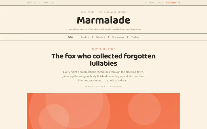
Fiction
Illustrates children's-book warmth with bold outlines and saturated color.

Arcade
Presses chunky pixel buttons and rainbow shadows into arcade-cabinet fun.
More from @staqd
View profileEditorial Pack
Collects the editorial cluster — typography-led, content-first pages in one install.
Design Systems Pack
Bundles every aesthetic design system in one install — switch styles per project.
Fiction
Illustrates children's-book warmth with bold outlines and saturated color.
Arcade
Presses chunky pixel buttons and rainbow shadows into arcade-cabinet fun.