Dithered
Grinds retro pixel noise into clean layouts for texture with intent.
- Version
- v1.0.0 · Updated Jul 18, 2026
- Context
- ≈1,658 tokens
- Security
- ✓ scanned
- License
- Single seat
- Works with
- Claude Code, Cursor, Codex
Checkout opens soon · launches at $9
≈1,658 tokens · v1.0.0
Live demo — an original page built in the Dithered style. Open in new tab
About this skill
Dithered design uses patterned pixel-like textures and controlled noise to add retro character, depth, and visual grit while keeping layouts clean and intentional. Its live demo renders a product launch landing page — centered hero, feature showcase, pricing, and FAQ.
The skill file
Dithered is a retro-machine aesthetic that borrows the visual language of early bitmap displays — ordered stipple patterns, halftone bands, and controlled noise — and applies it with restraint to otherwise modern, well-spaced layouts. The grit lives in textures and edges, never in the typography or alignment, so the result reads as deliberate craft rather than chaos. It creates a feeling of analog warmth fused with engineered precision, like a well-made instrument. Reach for it when a product wants personality and a hand-built signal without tipping into full kitsch.
Design principles
- Texture is decoration, never structure: dither patterns sit behind or beside content, never inside reading areas.
- Keep the grid clean and the type sharp; the contrast between crisp text and noisy fields is the entire point.
- Favor flat fills and 1px borders over soft shadows — depth is implied by stippling, not blur.
- Limit the palette hard; let one warm accent and one cool secondary carry all emphasis.
- Every dither field should have intent: a fade, a band, a highlight — never a full-bleed wash of noise.
- Pixel-snap everything. Borders, dividers, and pattern cells align to a 4px sub-grid for that machine-cut feel.
Color
The system is anchored in near-black #0E0E12 for the canvas, with a slightly lifted #1C1C24 for raised surfaces so panels separate quietly without relying on borders alone. Foreground text is a warm off-white parchment #E8E4D8 that softens the screen glow and reinforces the analog mood.
The primary action color is a hot signal orange #FF5C39, used sparingly on the single most important control per view, while a cool mint #5BD6C2 handles secondary highlights, links, and data emphasis. Muted metadata sits at #7A7A88, and hairline structure uses #33333F.
Token reference:
- Canvas / page:
#0E0E12 - Raised surface / card:
#1C1C24 - Primary action:
#FF5C39 - Secondary / data:
#5BD6C2 - Body text:
#E8E4D8 - Muted / metadata:
#7A7A88 - Hairline border:
#33333F
For a light variant, invert to an #E8E4D8 canvas with #0E0E12 ink, render dither stipples in #33333F at low opacity, and keep both accents identical so brand recognition survives the flip. The orange should never appear on a light field without a dark plate behind it, or it loses its signal-like punch.
- Typography
- Layout & spacing
- Components
- Do and don't
- Motion
- Accessibility
- Use it with your AI tool
Preview ends here
Typography, Layout & spacing, Components, Do and don't, Motion, Accessibility & Use it with your AI tool unlock when checkout opens. Get notified
What's inside
- SKILL.md6.6 KB
More in Design
View allEditorial Pack
Collects the editorial cluster — typography-led, content-first pages in one install.
Design Systems Pack
Bundles every aesthetic design system in one install — switch styles per project.
Fiction
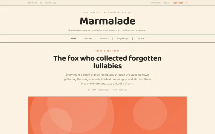
Illustrates children's-book warmth with bold outlines and saturated color.

Arcade
Presses chunky pixel buttons and rainbow shadows into arcade-cabinet fun.
More from @staqd
View profileEditorial Pack
Collects the editorial cluster — typography-led, content-first pages in one install.
Design Systems Pack
Bundles every aesthetic design system in one install — switch styles per project.
Fiction
Illustrates children's-book warmth with bold outlines and saturated color.
Arcade
Presses chunky pixel buttons and rainbow shadows into arcade-cabinet fun.