Doodle
Scribbles sketchy lines and playful shapes into friendly, human interfaces.
- Version
- v1.0.0 · Updated Jul 18, 2026
- Context
- ≈1,189 tokens
- Security
- ✓ scanned
- License
- Single seat
- Works with
- Claude Code, Cursor, Codex
Checkout opens soon · launches at $9
≈1,189 tokens · v1.0.0
Live demo — an original page built in the Doodle style. Open in new tab
About this skill
Hand-drawn/doodle style is informal and expressive, with sketchy lines, playful shapes, and imperfect details that make the interface feel friendly, human, and creative. Its live demo renders a personal portfolio — intro, selected work, about, and contact.
The skill file
Doodle is the interface equivalent of a sketchbook margin: wobbly ink lines, hand-lettered headings, and cheerful imperfection that says "made by people, for people." It lowers the stakes and invites play, which makes it perfect for creative tools, learning products, and anything that wants to feel warm rather than corporate. Reach for it when polish would feel cold and a little mess would feel honest.
Design principles
- Embrace imperfection. Borders wobble, corners vary, and nothing is pixel-perfect on purpose.
- Ink over gradients. Use flat fills and hard offset shadows that mimic pen on paper.
- Hand-lettered personality. Headings feel drawn, not typeset.
- Warmth first. Cream paper background and friendly rounded body type set a low-pressure tone.
- Decorate sparingly with doodles. Stars, squiggles, and arrows add charm without clutter.
- Keep it legible. Playful never means hard to read; structure stays clear underneath the sketch.
Color
The canvas is a warm paper cream (#FFF8EC) with pure white (#FFFFFF) surfaces for cards and inputs, like a fresh sheet laid on a desk. Ink (#1F1B16) is the workhorse for text and every hand-drawn border. The marker pink primary (#FF5C8A) energizes calls to action and headings, while teal secondary (#3FB7C4) and a sunny #FFC94D highlight add playful pops. Muted brown-grey (#8A8276) carries hints and placeholders. For a dark variant, switch to a chalkboard #26221C background with #2F2A23 surfaces, a chalk-white #F4EEE2 foreground, and keep the same pink and teal so the doodles glow like colored chalk.
Typography
Headings use Patrick Hand or a comparable casual script with a slight 1-2 degree rotation to feel hand-placed. Body copy is Nunito at 400-600 with rounded terminals and a roomy 1.7 line-height for an approachable read. Labels stay in the same friendly family, slightly bolder. Space Mono handles any code or numeric callouts and adds a charming typewriter contrast. The scale is loose (1.25) so headings feel expressive and pages breathe.
- Layout & spacing
- Components
- Motion
- Accessibility
- Use it with your AI tool
Preview ends here
Layout & spacing, Components, Motion, Accessibility & Use it with your AI tool unlock when checkout opens. Get notified
What's inside
- SKILL.md4.7 KB
More in Design
View allEditorial Pack
Collects the editorial cluster — typography-led, content-first pages in one install.
Design Systems Pack
Bundles every aesthetic design system in one install — switch styles per project.
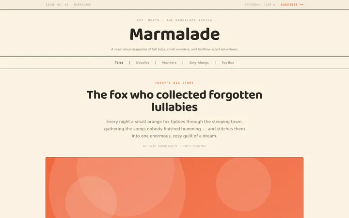
Fiction
Illustrates children's-book warmth with bold outlines and saturated color.

Arcade
Presses chunky pixel buttons and rainbow shadows into arcade-cabinet fun.
More from @staqd
View profileEditorial Pack
Collects the editorial cluster — typography-led, content-first pages in one install.
Design Systems Pack
Bundles every aesthetic design system in one install — switch styles per project.
Fiction
Illustrates children's-book warmth with bold outlines and saturated color.
Arcade
Presses chunky pixel buttons and rainbow shadows into arcade-cabinet fun.