Dramatic
Commands attention with theatrical contrast and high-impact typography.
- Version
- v1.0.0 · Updated Jul 18, 2026
- Context
- ≈1,326 tokens
- Security
- ✓ scanned
- License
- Single seat
- Works with
- Claude Code, Cursor, Codex
Checkout opens soon · launches at $9
≈1,326 tokens · v1.0.0
Live demo — an original page built in the Dramatic style. Open in new tab
About this skill
Dramatic design uses bold contrast, striking typography, and high-impact visuals to create a powerful, attention-commanding interface. Its live demo renders an agency portfolio — hero, selected-work grid, services, and contact CTA.
The skill file
Dramatic is a high-contrast, cinematic design language built to seize attention the instant a screen loads. It pairs near-black canvases with a single saturated red and oversized, confident typography so that every page reads like a film poster or a magazine spread. Reach for Dramatic when the goal is impact over subtlety: launches, headline moments, and brands that want to feel bold, premium, and a little theatrical.
Design principles
- Commit to one focal point per view. Drama comes from restraint, not clutter, so let a single headline or image dominate.
- Use contrast as the primary tool: deep black against bright foreground, with red appearing only where you want the eye to land.
- Treat type as imagery. Display headings are large enough to crop, overlap, and bleed off the canvas.
- Keep the palette ruthlessly small. One accent, one neutral light, layered dark surfaces, and nothing else.
- Favor hard edges and directional shadows over soft glows; the look should feel cut from paper, not airbrushed.
- Reserve motion for entrances and reveals so transitions feel staged and intentional.
Color
The canvas is a near-black #0A0A0B, with cards and raised regions on #16161A to create quiet depth. Foreground text and most UI sit in a warm off-white #F5F5F4, while #9A9A9E carries secondary and muted copy. The signature is the primary red #E11D2A, used sparingly for CTAs, active states, and the occasional inverted panel. Borders are a barely-there #2A2A30. In light mode, flip the relationship: a #F5F5F4 background, #FFFFFF surfaces, #0A0A0B foreground, and the same #E11D2A accent, which reads even hotter against white. Never dilute the red with tints; its power depends on appearing rarely and at full saturation.
Typography
Headings use Archivo (or a similarly grotesque, high-weight sans) at 700-900 weights with tight -0.03em tracking, set in sentence case for editorial gravity. Display sizes run from 64px up to 120px and are allowed to span the full container. Body copy uses Inter at 400-500, 16-18px, with a comfortable 1.6 line-height for readability against dark surfaces. The scale follows an aggressive perfect-fourth ratio (1.333) so the jump from body to headline feels abrupt and deliberate. Use the mono stack only for labels, counters, and numeric data, tracked at +0.04em in uppercase.
- Layout & spacing
- Components
- Motion
- Accessibility
- Use it with your AI tool
Preview ends here
Layout & spacing, Components, Motion, Accessibility & Use it with your AI tool unlock when checkout opens. Get notified
What's inside
- SKILL.md5.3 KB
More in Design
View allEditorial Pack
Collects the editorial cluster — typography-led, content-first pages in one install.
Design Systems Pack
Bundles every aesthetic design system in one install — switch styles per project.
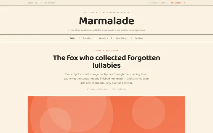
Fiction
Illustrates children's-book warmth with bold outlines and saturated color.

Arcade
Presses chunky pixel buttons and rainbow shadows into arcade-cabinet fun.
More from @staqd
View profileEditorial Pack
Collects the editorial cluster — typography-led, content-first pages in one install.
Design Systems Pack
Bundles every aesthetic design system in one install — switch styles per project.
Fiction
Illustrates children's-book warmth with bold outlines and saturated color.
Arcade
Presses chunky pixel buttons and rainbow shadows into arcade-cabinet fun.