Elegant
Glides through generous whitespace with delicate type and smooth transitions.
- Version
- v1.0.0 · Updated Jul 18, 2026
- Context
- ≈1,321 tokens
- Security
- ✓ scanned
- License
- Single seat
- Works with
- Claude Code, Cursor, Codex
Checkout opens soon · launches at $9
≈1,321 tokens · v1.0.0
Live demo — an original page built in the Elegant style. Open in new tab
About this skill
A graceful and polished design system with generous whitespace, delicate typography, and smooth transitions. Its live demo renders an e-commerce storefront — collection hero, product cards, lookbook strip, and reviews.
The skill file
Elegant is a calm, refined design language defined by space, restraint, and quiet sophistication. It leans on a warm off-white canvas, delicate serif headlines, and a single muted gold accent to create interfaces that feel curated and unhurried. Reach for Elegant when you want a sense of luxury, craft, and editorial polish: fashion houses, premium services, and content that deserves room to breathe.
Design principles
- Let whitespace do the work. Generous margins and airy spacing communicate quality more than any decoration.
- Pair a graceful serif for headings with a clean sans for body to balance character and clarity.
- Keep color whisper-quiet: warm neutrals carry the page, and a soft gold appears only as a refined punctuation.
- Favor thin lines, light weights, and gentle curves; nothing should feel heavy or loud.
- Maintain a strict reading measure so long text stays comfortable and composed.
- Choose subtlety in every interaction; transitions should be felt, not noticed.
Color
The background is a warm off-white #FBFAF7 that softens the entire interface, with pure #FFFFFF surfaces for cards and panels to create the faintest layering. Text sits in a near-black warm charcoal #1C1B19 rather than harsh pure black, keeping the tone gentle. Secondary and supporting copy uses #8A877F, a muted warm gray. The accent is a soft antique gold #9C7A4A, used for links, small CTAs, prices, and active states. Borders and dividers are a delicate #E8E4DC. For dark mode, shift to a deep #1C1B19 background, #242220 surfaces, #FBFAF7 foreground, and a slightly brighter gold #B89360 so the accent retains warmth. Avoid saturated color entirely; elegance lives in the spaces between hues, not in their intensity.
Typography
Headings use Cormorant Garamond (or a comparable high-contrast serif) at light-to-regular weights, set large at 40-80px with neutral 0em tracking so the letterforms keep their natural grace. Body copy uses Inter at 400, 17-18px, with a relaxed 1.7 line-height and a hint of 0.01em tracking for an open, breathable texture. The type scale follows a gentle major-third ratio (1.25) so steps feel smooth and harmonious. Italic serif is welcome for pull quotes and emphasis. Use the mono stack only for fine print, captions, or metadata, kept small and unobtrusive.
- Layout & spacing
- Components
- Motion
- Accessibility
- Use it with your AI tool
Preview ends here
Layout & spacing, Components, Motion, Accessibility & Use it with your AI tool unlock when checkout opens. Get notified
What's inside
- SKILL.md5.2 KB
More in Design
View allEditorial Pack
Collects the editorial cluster — typography-led, content-first pages in one install.
Design Systems Pack
Bundles every aesthetic design system in one install — switch styles per project.
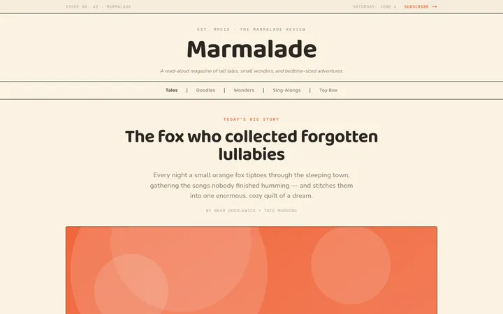
Fiction
Illustrates children's-book warmth with bold outlines and saturated color.

Arcade
Presses chunky pixel buttons and rainbow shadows into arcade-cabinet fun.
More from @staqd
View profileEditorial Pack
Collects the editorial cluster — typography-led, content-first pages in one install.
Design Systems Pack
Bundles every aesthetic design system in one install — switch styles per project.
Fiction
Illustrates children's-book warmth with bold outlines and saturated color.
Arcade
Presses chunky pixel buttons and rainbow shadows into arcade-cabinet fun.