Enterprise
Standardizes clean, high-contrast patterns for serious enterprise software.
- Version
- v1.0.0 · Updated Jul 18, 2026
- Context
- ≈1,216 tokens
- Security
- ✓ scanned
- License
- Single seat
- Works with
- Claude Code, Cursor, Codex
Checkout opens soon · launches at $9
≈1,216 tokens · v1.0.0
Live demo — an original page built in the Enterprise style. Open in new tab
About this skill
A clean, high-contrast, professional design system for enterprise applications. Its live demo renders an analytics dashboard — KPI tiles, revenue charts, and a data table.
The skill file
Enterprise is built for software people use all day to run real operations. It is high-contrast, dense, and unflinchingly clear, prioritizing scannable data and unambiguous actions over decoration. Reach for it when the audience is professionals managing complex systems, where trust comes from precision and consistency rather than flourish.
Design principles
- Clarity above all. Every label, value, and action reads instantly with no guesswork.
- Density with discipline. Pack information efficiently, but use whitespace and alignment to keep it scannable.
- Strong, stable hierarchy. One primary action per view; consistent placement of nav, filters, and tables.
- High contrast for long sessions. Type and structure stay legible under bright office lighting and on aging monitors.
- Predictable patterns. Reuse the same table, form, and modal conventions everywhere to reduce cognitive load.
- Restrained color. Accent blue carries meaning; status colors are reserved strictly for state.
Color
The workspace background is a cool light grey (#F4F6FA) that lets white (#FFFFFF) surfaces stand forward as panels and cards. Deep slate (#0F1626) is the foreground and secondary tone, delivering crisp, high-contrast text. The blue primary (#1F5FE0) marks primary buttons, links, and active nav. Muted slate (#475569) handles secondary labels and metadata, and a calm #D6DCE6 defines borders and dividers. Reserve status colors strictly: green #16A34A for success, amber #D97706 for warning, red #DC2626 for error. For dark mode, use a #0B1120 background, #131A2A surfaces, #E6EBF3 foreground, #9AA6BC muted, and a brightened blue #5B8DEF for accents to hold contrast.
Typography
IBM Plex Sans anchors headings with a businesslike, neutral character at 600 weight and -0.01em tracking. Inter handles body and UI text for excellent screen rendering at small sizes. Dense tables run at 13-14px with tabular numerals for clean column alignment. IBM Plex Mono carries IDs, codes, and technical values. The scale is tight (1.18) because Enterprise screens favor information throughput over expressive headers; line-height stays at 1.5 for body and 1.3 for table rows.
- Layout & spacing
- Components
- Motion
- Accessibility
- Use it with your AI tool
Preview ends here
Layout & spacing, Components, Motion, Accessibility & Use it with your AI tool unlock when checkout opens. Get notified
What's inside
- SKILL.md4.8 KB
More in Design
View allEditorial Pack
Collects the editorial cluster — typography-led, content-first pages in one install.
Design Systems Pack
Bundles every aesthetic design system in one install — switch styles per project.
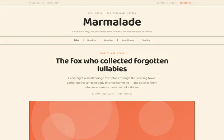
Fiction
Illustrates children's-book warmth with bold outlines and saturated color.

Arcade
Presses chunky pixel buttons and rainbow shadows into arcade-cabinet fun.
More from @staqd
View profileEditorial Pack
Collects the editorial cluster — typography-led, content-first pages in one install.
Design Systems Pack
Bundles every aesthetic design system in one install — switch styles per project.
Fiction
Illustrates children's-book warmth with bold outlines and saturated color.
Arcade
Presses chunky pixel buttons and rainbow shadows into arcade-cabinet fun.