Hatch
Ships indie-lean, no-fluff UI with clear metrics and zero decoration.
- Version
- v1.0.0 · Updated Jul 18, 2026
- Context
- ≈1,322 tokens
- Security
- ✓ scanned
- License
- Single seat
- Works with
- Claude Code, Cursor, Codex
Checkout opens soon · launches at $9
≈1,322 tokens · v1.0.0
Live demo — an original page built in the Hatch style. Open in new tab
About this skill
Hatch design is indiehacker-lean and ship-fast: bold, no-fluff UI with practical layouts, clear metrics, and builder-focused functionality inspired by the indie-hacker make-it-work ethos. Its live demo renders a developer docs page — code blocks, parameters table, API reference, and changelog.
The skill file
Hatch is the look of something built by one person who shipped it this weekend — and it actually works. It is blunt, dense, and unapologetically practical: big numbers, clear actions, no decorative filler.
The personality is confident and a little scrappy. The green accent reads like a green light — a "go" signal that pushes the user toward the one action that matters. Reach for Hatch when speed, clarity, and credibility matter more than polish-for-polish's-sake: solo SaaS, launch pages, internal tools, and dashboards that exist to get things done.
Design principles
- Function first. Every element earns its place; if it doesn't inform or enable an action, cut it.
- Make the number the hero. Metrics are big, bold, and impossible to miss.
- One loud action per view. A single green primary CTA; everything else stays quiet.
- Dense but legible. Pack information efficiently without crowding — tight spacing, clear hierarchy.
- Plain language, plain shapes. No gradients-for-decoration, no illustrations standing in for substance.
- Ship-fast honesty. The design should feel real and usable, not like a marketing render.
Color
The canvas is clean white (#FFFFFF) with light surfaces (#F7F9FA) for cards and panels. Ink is a near-black (#0E1116) for maximum legibility, with muted slate (#5B6670) for secondary text and labels.
- Primary: a confident "go" green (
#15C26B) — primary actions, positive deltas, highlights. - Warning: amber (
#F5C518) — attention states and neutral notices. - Negative: red (
#F5564A) — down-deltas and destructive confirmation. - Borders: light gray (
#E2E7EB) for separation.
Dark mode drops to a #0E1116 background with #171B22 surfaces, #E8ECEF text, and #8A95A0 muted. Brighten the green to #22D27A so the "go" signal still pops, and keep deltas green-up / red-down.
Typography
One workhorse neutral sans does nearly everything, kept tight and bold for a no-nonsense voice.
- Headlines: heavy weights (600-800), -0.03em tracking, confident and direct.
- Body: compact 14-15px to support density, weight 400-500.
- Metrics & prices: monospace at large sizes so figures align and feel precise.
- Labels: 12-13px uppercase or small-caps in muted slate.
Keep the scale punchy and the hierarchy obvious — a big jump from label to number to headline. Avoid serifs, scripts, and decorative faces; the voice is plain and fast.
- Layout & spacing
- Components
- Motion
- Accessibility
- Use it with your AI tool
Preview ends here
Layout & spacing, Components, Motion, Accessibility & Use it with your AI tool unlock when checkout opens. Get notified
What's inside
- SKILL.md5.3 KB
More in Design
View allEditorial Pack
Collects the editorial cluster — typography-led, content-first pages in one install.
Design Systems Pack
Bundles every aesthetic design system in one install — switch styles per project.
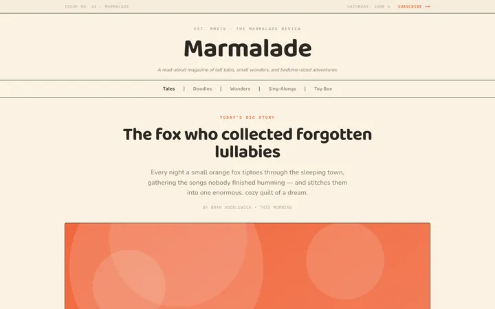
Fiction
Illustrates children's-book warmth with bold outlines and saturated color.

Arcade
Presses chunky pixel buttons and rainbow shadows into arcade-cabinet fun.
More from @staqd
View profileEditorial Pack
Collects the editorial cluster — typography-led, content-first pages in one install.
Design Systems Pack
Bundles every aesthetic design system in one install — switch styles per project.
Fiction
Illustrates children's-book warmth with bold outlines and saturated color.
Arcade
Presses chunky pixel buttons and rainbow shadows into arcade-cabinet fun.