Impeccable
Posterizes pages in cream and burnt orange with confident modern type.
- Version
- v1.0.0 · Updated Jul 18, 2026
- Context
- ≈1,359 tokens
- Security
- ✓ scanned
- License
- Single seat
- Works with
- Claude Code, Cursor, Codex
Checkout opens soon · launches at $9
≈1,359 tokens · v1.0.0
Live demo — an original page built in the Impeccable style. Open in new tab
About this skill
Impeccable design is a warm, graphic editorial-poster style with cream and burnt-orange sections, amber accents, high contrast, and confident modern typography. Its live demo renders a SaaS marketing landing page — hero, onboarding steps, pricing table, FAQ, and testimonials.
The skill file
Impeccable is editorial design with the volume turned up: a graphic-poster aesthetic built on warm cream and burnt-orange color blocks, golden amber accents, and typography that fills the room. It is confident, contemporary, and high-contrast, designed to make a strong first impression and hold it. Where many editorial styles whisper, Impeccable speaks clearly and stands tall. Reach for it when a brand needs presence, for campaigns, studios, conferences, and any site that should feel like a beautifully printed poster brought to the screen.
Design principles
- Color block boldly: large flat sections of cream and burnt orange create rhythm and drama.
- Type as the hero: oversized display headlines carry the design, with strong weight contrast.
- High contrast, warm tone: ink on cream and cream on orange, never muddy mid-tones.
- One golden accent: amber adds glow and points the eye without competing with the orange.
- Confident spacing: big margins, decisive alignment, nothing timid or crowded.
- Simple graphic shapes over busy decoration; let scale and color do the talking.
Color
The base canvas is a warm cream #F7EFE1, with a lighter golden surface #FBE9C8 for cards and quiet panels. The primary is a saturated burnt orange #D84B1E, used for full-bleed sections, primary buttons, and dramatic color blocks. The secondary accent is a golden amber #F0A11A, reserved for highlights, underlines, tags, and small graphic marks. Text is a deep warm ink #1B1714, near-black but warmer, which also defines borders. Muted metadata uses #7C6F5E. On burnt-orange sections, text flips to cream and amber for contrast. In dark mode, drop to an espresso ground #1A1411 with cream text #F2E7D5, keep burnt orange near #E2562A for blocks, and let amber glow at #F5B53F for accents.
Typography
Display headlines use Clash Display, a high-impact contemporary sans, at weights 600–700 with tight tracking (-0.03em) so giant titles feel engineered and intentional. Body text is Satoshi, a clean modern grotesque, at 1.0625rem with a 1.6 line-height. Numerals and code use JetBrains Mono for technical detail. The scale is deliberately poster-like, with display clamping between 3rem and 6rem and a large gap to body size, creating dramatic hierarchy. Strong weight contrast, big-to-small, is core to the look; mid-weights are avoided so headlines punch.
- Layout & spacing
- Components
- Motion
- Accessibility
- Use it with your AI tool
Preview ends here
Layout & spacing, Components, Motion, Accessibility & Use it with your AI tool unlock when checkout opens. Get notified
What's inside
- SKILL.md5.4 KB
More in Design
View allEditorial Pack
Collects the editorial cluster — typography-led, content-first pages in one install.
Design Systems Pack
Bundles every aesthetic design system in one install — switch styles per project.
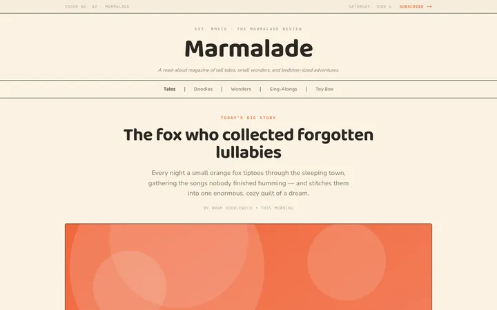
Fiction
Illustrates children's-book warmth with bold outlines and saturated color.

Arcade
Presses chunky pixel buttons and rainbow shadows into arcade-cabinet fun.
More from @staqd
View profileEditorial Pack
Collects the editorial cluster — typography-led, content-first pages in one install.
Design Systems Pack
Bundles every aesthetic design system in one install — switch styles per project.
Fiction
Illustrates children's-book warmth with bold outlines and saturated color.
Arcade
Presses chunky pixel buttons and rainbow shadows into arcade-cabinet fun.