Minimal
Removes everything unnecessary until only content and function remain.
- Version
- v1.0.0 · Updated Jul 18, 2026
- Context
- ≈1,128 tokens
- Security
- ✓ scanned
- Works with
- Claude Code, Cursor, Codex
Install via CLI
$ npx staqd add minimal≈1,128 tokens · v1.0.0
Live demo — an original page built in the Minimal style. Open in new tab
About this skill
A stripped-down design system that removes all unnecessary noise, focusing purely on content and core functionality. Its live demo renders a personal portfolio — intro, selected work, about, and contact.
The skill file
Minimal
Minimal is the discipline of removing until only the essential remains. It is built almost entirely from black, white, and the space between them, letting typography and content carry the entire experience. Reach for Minimal when the message is the product, when you want timeless clarity, or when a quiet, confident surface should disappear behind the work it presents.
Design principles
- Remove before you add. If an element does not serve content or function, it does not belong.
- Whitespace is a feature, not empty space. Generous margins create focus and calm.
- Monochrome first. Color is rationed to the single accent and used only when meaning requires it.
- Type does the heavy lifting. Hierarchy comes from size, weight, and spacing, not decoration.
- Borders over shadows. Structure is drawn with thin hairlines instead of depth effects.
- Restraint is the brand. Consistency and quiet confidence beat visual variety.
Color
The palette is intentionally narrow. The background is pure #FFFFFF, with #FAFAFA reserved for the occasional raised surface or code block. Text and the primary accent share #111111, a soft black that is easier on the eyes than absolute #000000. Secondary text uses #6B6B6B and the muted #8A8A8A handles captions and metadata. The only structural color is the #E6E6E6 border. There is no decorative color by default; if a brand hue is needed, introduce exactly one and use it solely for primary calls to action. For dark mode, flip to a #0E0E0E background, #1A1A1A surfaces, #F2F2F2 foreground, and a #2A2A2A border, keeping the same restraint.
Typography
Inter carries both headings and body for a clean, neutral, and highly readable voice. Headings use 600 weight with a slight -0.01em tracking; body stays at 400 weight, 0 tracking, and a comfortable 1.6 line-height that makes long passages effortless. The type scale is a restrained 1.25x progression, so hierarchy is felt rather than shouted. Measure is capped around 680px for reading comfort. IBM Plex Mono handles code and tabular figures. Emphasis comes from weight or the single accent, never from italics or color noise.
Layout & spacing
Layouts are built on a single, centered column for content and a calm two-column split at most for tools. The spacing system uses an 8px base with frequent use of large 48px to 96px vertical gaps between sections. Containers cap at 680px for reading and 1080px for app layouts. Density is deliberately low; the design trusts the user with space. Alignment is consistently left, and grids stay simple and predictable.
Components
- Buttons are flat: a solid #111111 fill for primary, a thin #E6E6E6 outline for secondary, with a 6px radius and no shadow.
- Inputs are plain rectangles with a 1px #E6E6E6 border that darkens to #111111 on focus, no fill change.
- Cards are #FAFAFA blocks defined by a hairline border rather than elevation, with comfortable internal padding.
- Navigation is a slim top bar with plain text links; the active link is simply #111111 while others sit at #6B6B6B.
- Modals appear over a light scrim with a plain bordered panel and no glow or heavy shadow.
- Tables use only horizontal #E6E6E6 rules, no zebra striping, with a quiet #8A8A8A header row.
- Badges are understated: a thin #E6E6E6 outline with #6B6B6B text, never filled with bright color.
Motion
Motion is minimal and almost invisible. Use short 120ms to 160ms fades and color transitions on hover and focus with a simple ease-out curve. Avoid movement, slides, and bounce. State changes are quiet: a link underlines, a button darkens slightly, an input border deepens. The goal is to feel instant and frictionless rather than animated.
Accessibility
Contrast is excellent by default: #111111 on #FFFFFF far exceeds WCAG 2.2 AA, and #6B6B6B passes for body text. Focus states use a clear 2px #111111 outline with a small offset so keyboard navigation is obvious. Because color is barely used, information is never conveyed by color alone. Reduced-motion preferences are easy to honor since motion is already negligible; remaining fades become instant. Hit targets stay at least 44px tall, and link text is descriptive rather than relying on "click here."
Use it with your AI tool
Paste this skill into your AI coding tool (Claude, Cursor, Codex), then prompt for the component you need. Install: npx staqd add minimal
What's inside
- SKILL.md4.5 KB
More in Design
View allEditorial Pack
Collects the editorial cluster — typography-led, content-first pages in one install.
Design Systems Pack
Bundles every aesthetic design system in one install — switch styles per project.
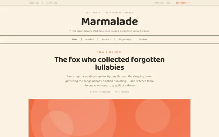
Fiction
Illustrates children's-book warmth with bold outlines and saturated color.

Arcade
Presses chunky pixel buttons and rainbow shadows into arcade-cabinet fun.
More from @staqd
View profileEditorial Pack
Collects the editorial cluster — typography-led, content-first pages in one install.
Design Systems Pack
Bundles every aesthetic design system in one install — switch styles per project.
Fiction
Illustrates children's-book warmth with bold outlines and saturated color.
Arcade
Presses chunky pixel buttons and rainbow shadows into arcade-cabinet fun.