Perspective
Tilts layouts into angled, layered depth for interfaces with real dimension.
- Version
- v1.0.0 · Updated Jul 18, 2026
- Context
- ≈1,476 tokens
- Security
- ✓ scanned
- License
- Single seat
- Works with
- Claude Code, Cursor, Codex
Checkout opens soon · launches at $9
≈1,476 tokens · v1.0.0
Live demo — an original page built in the Perspective style. Open in new tab
About this skill
Perspective design adds depth and direction through angled layouts, layered elements, and visual foreshortening, creating a dynamic interface with a strong sense of space. Its live demo renders a product launch landing page — centered hero, feature showcase, pricing, and FAQ.
The skill file
Perspective gives a flat screen real spatial drama. By tilting planes in 3D, layering panels at different depths, and shrinking elements as they recede toward a vanishing point, it turns a static page into a scene you could walk into. A receding grid floor, directional shadows, and cool rim lighting sell the illusion of space and motion. Reach for Perspective on product showcases, tech and SaaS landing pages, and immersive hero or onboarding screens where you want the interface to feel cinematic and forward-moving.
Design principles
- Establish a consistent vanishing point and light direction, then commit every angled element to it.
- Use foreshortening for hierarchy: nearer elements are larger, sharper, and brighter; distant ones shrink and dim.
- Layer panels at distinct depths so the composition reads front-to-back, not just left-to-right.
- Let shadows and rim light be directional—they reinforce where the light and the viewer stand.
- Keep the canvas dark and deep so glowing accents and depth gradients carry the sense of space.
- Use 3D sparingly and purposefully—tilt the hero and showcase, keep body content flat and readable.
Color
Perspective lives in deep space. The canvas is a near-black navy (#0B1020) that recedes infinitely; surfaces are a lifted navy (#141B30) for panels that float above it. Foreground text is a cool off-white (#E8ECF5); muted text and distant labels use #8A93AD. Depth is reinforced by two accents that double as light: a cyan (#22D3EE) for near rim light, primary actions, and highlights, and a violet (#7C5CFF) for the far end of depth gradients and secondary glow. Borders (#26304B) define panel edges in low light. Use a violet-to-cyan gradient on the receding grid floor and as a glow behind the hero subject to imply atmosphere and distance.
For a lighter variant, raise the canvas to #EEF1F8 with surfaces #FFFFFF, foreground #141B30, muted #5A6479, and keep the cyan and violet accents—but soften glows and rely more on directional shadow than rim light, since glows read weakly on light backgrounds.
- Typography
- Layout & spacing
- Components
- Motion
- Accessibility
- Use it with your AI tool
Preview ends here
Typography, Layout & spacing, Components, Motion, Accessibility & Use it with your AI tool unlock when checkout opens. Get notified
What's inside
- SKILL.md5.9 KB
More in Design
View allEditorial Pack
Collects the editorial cluster — typography-led, content-first pages in one install.
Design Systems Pack
Bundles every aesthetic design system in one install — switch styles per project.
Fiction
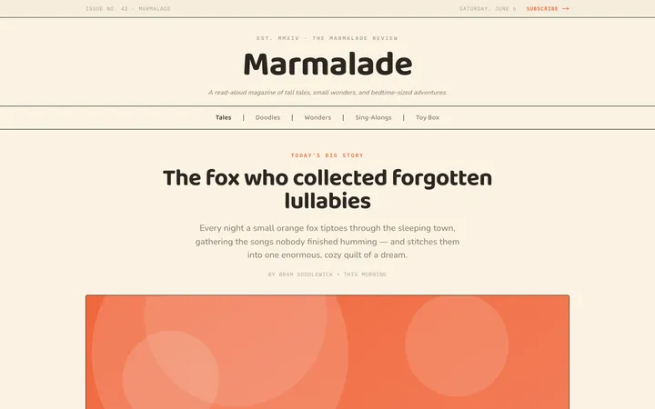
Illustrates children's-book warmth with bold outlines and saturated color.

Arcade
Presses chunky pixel buttons and rainbow shadows into arcade-cabinet fun.
More from @staqd
View profileEditorial Pack
Collects the editorial cluster — typography-led, content-first pages in one install.
Design Systems Pack
Bundles every aesthetic design system in one install — switch styles per project.
Fiction
Illustrates children's-book warmth with bold outlines and saturated color.
Arcade
Presses chunky pixel buttons and rainbow shadows into arcade-cabinet fun.