Publication
Typesets long-form content with structured grids and measured spacing.
- Version
- v1.0.0 · Updated Jul 18, 2026
- Context
- ≈1,435 tokens
- Security
- ✓ scanned
- License
- Single seat
- Works with
- Claude Code, Cursor, Codex
Checkout opens soon · launches at $9
≈1,435 tokens · v1.0.0
Live demo — an original page built in the Publication style. Open in new tab
About this skill
Publication design is editorial and content-first, combining strong typography, structured grids, and measured spacing to deliver clear, readable, long-form information. Its live demo renders a magazine front page — masthead, lead story with pull quote, story grid, and newsletter signup.
The skill file
Publication is a content-first, editorial system descended from print magazines and fine book design. It puts typography in the lead — confident serif headlines, carefully measured reading columns, and a disciplined baseline grid — so that long-form text feels effortless and authoritative. The mood is calm, literate, and trustworthy, the kind of page you settle into rather than skim. Reach for it on blogs, magazines, essays, documentation, and newsletters where the words are the product and reading comfort is paramount.
Design principles
- The text is the design; everything else exists to serve readability and rhythm.
- Respect the measure — keep reading columns at 60–75 characters so the eye never strains.
- Build on a baseline grid so type, rules, and images all align to a shared vertical rhythm.
- Use hierarchy from a real type scale: distinct display, heading, deck, body, and caption roles.
- Decorate sparingly — hairline rules, small-caps kickers, drop caps, and a single editorial accent.
- Whitespace is structural, not leftover; generous margins frame the content like a printed page.
Color
The canvas is a warm paper #FBF9F4 that reduces glare and evokes quality stock, with featured surfaces and image frames stepping up to pure #FFFFFF. Ink is a soft near-black #1A1916 for body text, easing the contrast for long reading sessions. Secondary text — decks, captions, bylines, kickers — uses a warm gray #5C584E. The single editorial accent is a classic ink-red #B23A20, reserved for links, pull-quote rules, drop caps, and section markers so it always signals editorial emphasis. Hairline rules and borders use #E7E2D6. A dark "evening edition" variant flips to a #17161F ground with #EDEAE0 ink, #2A2832 rules, and a brightened #E0603F accent for comfortable night reading.
Typography
Headings use Fraunces, an expressive high-contrast serif, at large display sizes with tight -0.015em tracking for that magazine-cover impact. Body copy is set in Source Serif 4 at 19–20px with a roomy 1.7 line-height for sustained reading comfort. Decks (subheadings under a title) and captions use the same body face at smaller sizes in muted gray. Kickers and bylines use small-caps with +0.08em tracking. Mono appears only for code and data in IBM Plex Mono. The scale is a generous major-third (1.25), giving a clear ladder from display down to caption. Italics in the serif faces are genuine cuts, not slanted — lean on them for emphasis.
- Layout & spacing
- Components
- Motion
- Accessibility
- Use it with your AI tool
Preview ends here
Layout & spacing, Components, Motion, Accessibility & Use it with your AI tool unlock when checkout opens. Get notified
What's inside
- SKILL.md5.7 KB
More in Design
View allEditorial Pack
Collects the editorial cluster — typography-led, content-first pages in one install.
Design Systems Pack
Bundles every aesthetic design system in one install — switch styles per project.
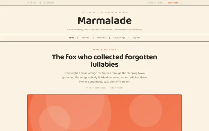
Fiction
Illustrates children's-book warmth with bold outlines and saturated color.

Arcade
Presses chunky pixel buttons and rainbow shadows into arcade-cabinet fun.
More from @staqd
View profileEditorial Pack
Collects the editorial cluster — typography-led, content-first pages in one install.
Design Systems Pack
Bundles every aesthetic design system in one install — switch styles per project.
Fiction
Illustrates children's-book warmth with bold outlines and saturated color.
Arcade
Presses chunky pixel buttons and rainbow shadows into arcade-cabinet fun.