Sketch
Draws warm paper pages with handwritten headings and pencil-soft shadows.
- Version
- v1.0.0 · Updated Jul 18, 2026
- Context
- ≈1,358 tokens
- Security
- ✓ scanned
- License
- Single seat
- Works with
- Claude Code, Cursor, Codex
Checkout opens soon · launches at $9
≈1,358 tokens · v1.0.0
Live demo — an original page built in the Sketch style. Open in new tab
About this skill
Sketch design is a friendly hand-drawn style with warm cream paper, soft teal accents, handwritten headings, rounded pill controls, dashed outlines, and pencil-like offset shadows. Its live demo renders a personal portfolio — intro, selected work, about, and contact.
The skill file
Sketch is the look of a smart idea jotted in a notebook: warm paper, confident handwriting, and a friendly teal pen. It trades slick precision for charm, using dashed outlines, rounded pill controls, and pencil-like offset shadows to make interfaces feel approachable and human. The style invites participation, which makes it perfect for tools where people brainstorm, learn, or play. Reach for Sketch when you want warmth and personality, and when a little imperfection makes the product feel more inviting, not less trustworthy.
Design principles
- Everything feels hand-placed: slight rotations, dashed lines, and offset shadows over rigid perfection.
- Friendly geometry: pill-rounded controls and soft cards lower the stakes for the user.
- Warm, paper-first palette with ink linework so the screen reads like a notebook page.
- A clear two-color voice: teal for actions, amber for highlights and play.
- Handwriting for personality, rounded sans-serif for clarity; never sacrifice readability.
- Keep contrast high so the friendly look still feels crisp and legible.
Color
The page is warm cream paper #FCF8F0, with crisp white #FFFFFF cards and notes layered on top so they pop like pasted paper. The ink color #2E2A26 does all the linework: borders, headings, and offset shadows, giving the whole interface a drawn-by-hand outline. The primary accent is a soft teal #2FA39A, used for buttons, active states, links, and key icons. A warm amber #E7B84B is the secondary accent for highlights, sticky notes, and playful emphasis. Muted text uses a soft taupe #857F76. In dark mode, switch to a chalkboard ground #23211D with cream ink-lines and text #F0EBE0, brighten teal toward #5FC9BF, and let amber glow at #F0C75E so the hand-drawn marks read clearly on dark.
Typography
Headings are set in Caveat, a lively handwriting face, at weights 500–700 and large sizes so they feel scrawled with intent. Body copy uses Nunito, a rounded humanist sans, at 1rem with a comfortable 1.7 line-height for easy reading. Captions, code, and labels can use Space Mono for a contrasting tactile detail. Labels and buttons stay in friendly sentence case rather than shouting in uppercase. The scale leans on contrast: oversized handwritten display (clamp 2.5rem–4rem) against calm, even body text, so headings feel personal and the content stays clear.
- Layout & spacing
- Components
- Motion
- Accessibility
- Use it with your AI tool
Preview ends here
Layout & spacing, Components, Motion, Accessibility & Use it with your AI tool unlock when checkout opens. Get notified
What's inside
- SKILL.md5.4 KB
More in Design
View allEditorial Pack
Collects the editorial cluster — typography-led, content-first pages in one install.
Design Systems Pack
Bundles every aesthetic design system in one install — switch styles per project.
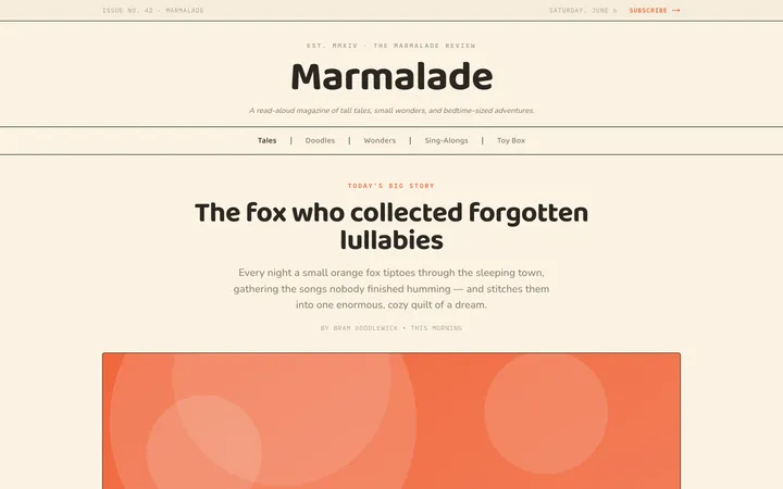
Fiction
Illustrates children's-book warmth with bold outlines and saturated color.

Arcade
Presses chunky pixel buttons and rainbow shadows into arcade-cabinet fun.
More from @staqd
View profileEditorial Pack
Collects the editorial cluster — typography-led, content-first pages in one install.
Design Systems Pack
Bundles every aesthetic design system in one install — switch styles per project.
Fiction
Illustrates children's-book warmth with bold outlines and saturated color.
Arcade
Presses chunky pixel buttons and rainbow shadows into arcade-cabinet fun.