Skeumorphism
Mimics real-world materials so digital objects feel tangible and familiar.
- Version
- v1.0.0 · Updated Jul 18, 2026
- Context
- ≈1,462 tokens
- Security
- ✓ scanned
- License
- Single seat
- Works with
- Claude Code, Cursor, Codex
Checkout opens soon · launches at $9
≈1,462 tokens · v1.0.0
Live demo — an original page built in the Skeumorphism style. Open in new tab
About this skill
Skeuomorphism style mimics real-world materials and objects, using rich textures, shadows, and depth to make digital elements feel tangible and familiar. Its live demo renders a mobile app landing page — phone mockups, feature tiles, mini charts, and app-store CTAs.
The skill file
Skeumorphism makes the screen feel like an object. By borrowing the textures, highlights, and shadows of real materials — brushed metal, leather, glass, felt — it gives every control a sense of weight and touchability. Buttons look pressable, switches look flippable, and panels feel like they have thickness. The result is warm, familiar, and unmistakably tactile. Reach for Skeumorphism when you want delight and physicality: music and creative tools, nostalgic consumer apps, and dashboards that lean on real-world metaphors like dials and switches.
Design principles
- Imitate real materials — every surface suggests a texture you could feel.
- Light comes from above; build depth with a top highlight and a bottom shadow on every raised element.
- Recess inputs and displays (inset shadow) and raise controls (drop shadow) so affordance is obvious.
- Add fine grain, gloss, and bevels — but keep them subtle enough that text stays crisp.
- Make pressing physical: controls should visibly depress and darken on press.
- Use detail to communicate function, not just to decorate.
Color
The palette is warm and material, like aged plastic and metal. The background is a soft taupe-stone (#E4E1D8) carrying a faint noise texture, with raised surfaces in a lighter bone (#F5F2EA) that catch the top light. Text is a deep warm graphite (#2B2622) for an engraved, ink-on-plastic feel, with muted stone (#857E72) for secondary labels. The primary accent is a glossy cobalt blue (#3E7BFA) for active buttons, sliders, and highlights, while a leather-brown secondary (#A6927B) supports material accents like stitching and panels. Borders are a stone gray (#C9C3B5) reinforced by inner highlights and outer shadows rather than flat lines. A dark "night" variant swaps to a brushed-charcoal background (#2A2826), gunmetal surfaces (#34322F), warm off-white text (#EDEAE2), and keeps the cobalt glossy and bright against the metal.
- Typography
- Layout & spacing
- Components
- Motion
- Accessibility
- Use it with your AI tool
Preview ends here
Typography, Layout & spacing, Components, Motion, Accessibility & Use it with your AI tool unlock when checkout opens. Get notified
What's inside
- SKILL.md5.8 KB
More in Design
View allEditorial Pack
Collects the editorial cluster — typography-led, content-first pages in one install.
Design Systems Pack
Bundles every aesthetic design system in one install — switch styles per project.
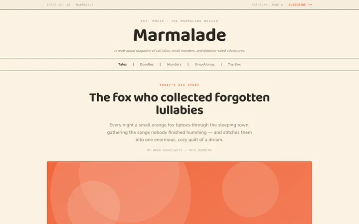
Fiction
Illustrates children's-book warmth with bold outlines and saturated color.

Arcade
Presses chunky pixel buttons and rainbow shadows into arcade-cabinet fun.
More from @staqd
View profileEditorial Pack
Collects the editorial cluster — typography-led, content-first pages in one install.
Design Systems Pack
Bundles every aesthetic design system in one install — switch styles per project.
Fiction
Illustrates children's-book warmth with bold outlines and saturated color.
Arcade
Presses chunky pixel buttons and rainbow shadows into arcade-cabinet fun.