Vellum
Sets research-journal calm — warm ivory, slate ink, sparse clay accents.
- Version
- v1.0.0 · Updated Jul 18, 2026
- Context
- ≈1,372 tokens
- Security
- ✓ scanned
- License
- Single seat
- Works with
- Claude Code, Cursor, Codex
Checkout opens soon · launches at $9
≈1,372 tokens · v1.0.0
Live demo — an original page built in the Vellum style. Open in new tab
About this skill
Vellum design is a restrained editorial style inspired by research journals: warm ivory surfaces, near-black slate ink, sharp contrast, and sparse clay accents create an authoritative, minimal, highly readable interface. Its live demo renders a magazine front page — masthead, lead story with pull quote, story grid, and newsletter signup.
The skill file
Vellum is a quiet, authoritative editorial style modeled on the typographic discipline of research journals and printed reference works. Warm ivory surfaces and near-black slate ink produce sharp, comfortable contrast, while a single restrained clay accent does all the highlighting the page ever needs. The feeling is scholarly, trustworthy, and unhurried. Reach for Vellum when reading is the product and you want long passages of text to feel effortless and the interface to disappear behind the content.
Design principles
- Readability is the entire brief: measure, line-height, and contrast are tuned for sustained reading.
- Color is used sparingly; ink and paper carry the page, with clay reserved for genuine emphasis.
- Hairline borders and paper warmth replace shadows and heavy chrome.
- Serif typography establishes an authoritative, printed-page voice throughout.
- Hierarchy comes from type weight, size, and small caps rather than color or decoration.
- Restraint is a feature: nothing decorative competes with the words.
Color
The base canvas is warm ivory (#F4EFE6); content surfaces lift slightly to a lighter parchment (#FBF8F1).
Ink is a near-black warm slate (#1C1B19) used for body and headings, giving a softer, less clinical contrast than pure black on white.
The lone accent is muted clay (#A6543A), reserved for links, active states, and key reference markers.
Secondary and metadata text use a warm taupe (#7A746B).
Borders are a faint sand hairline (#DAD2C3), and a deeper sand (#C9B79C) marks subtle dividers and pull-quote rules.
Use clay sparingly: if more than a few elements per screen are accented, the scholarly calm is lost.
In dark mode, shift the canvas to a warm charcoal (#23211D), surfaces to #2C2A25, and ink to a soft ivory (#EFE9DD).
Keep clay slightly brightened (#C26A4C) for link legibility against the dark field.
Typography
Both headings and body are set in a refined text serif (Source Serif 4 or Lora). Body runs at 18px with a generous 1.7 line-height for long reading; headings use weights 600 to 700 with tight tracking (-0.01em). Eyebrows, section labels, and metadata use small caps with +0.06em tracking.
The scale is classical at a 1.25 ratio (18, 22, 28, 35, 44). A monospace (iA Writer Mono) is reserved for code, footnote markers, and tabular figures. Keep the reading measure between 60 and 68 characters and never justify; left-aligned ragged-right preserves even spacing. Use real small caps and old-style numerals where the typeface supports them for an authentic printed feel.
- Layout & spacing
- Components
- Motion
- Accessibility
- Use it with your AI tool
Preview ends here
Layout & spacing, Components, Motion, Accessibility & Use it with your AI tool unlock when checkout opens. Get notified
What's inside
- SKILL.md5.4 KB
More in Design
View allEditorial Pack
Collects the editorial cluster — typography-led, content-first pages in one install.
Design Systems Pack
Bundles every aesthetic design system in one install — switch styles per project.
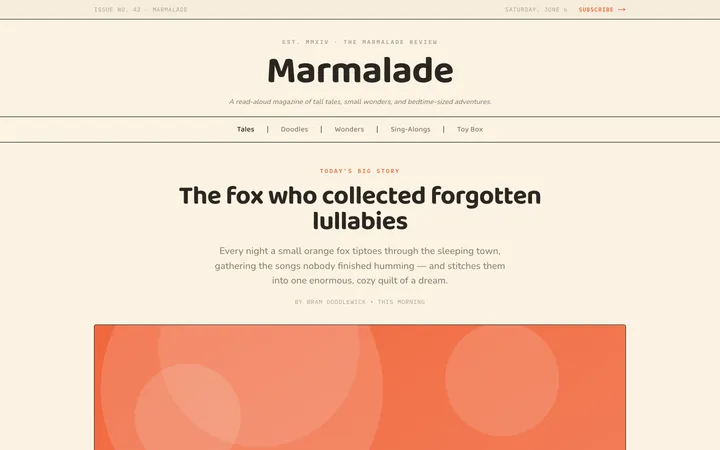
Fiction
Illustrates children's-book warmth with bold outlines and saturated color.

Arcade
Presses chunky pixel buttons and rainbow shadows into arcade-cabinet fun.
More from @staqd
View profileEditorial Pack
Collects the editorial cluster — typography-led, content-first pages in one install.
Design Systems Pack
Bundles every aesthetic design system in one install — switch styles per project.
Fiction
Illustrates children's-book warmth with bold outlines and saturated color.
Arcade
Presses chunky pixel buttons and rainbow shadows into arcade-cabinet fun.