Vibrant
Charges interfaces with bright color, playful gradients, and lively motion.
- Version
- v1.0.0 · Updated Jul 18, 2026
- Context
- ≈1,218 tokens
- Security
- ✓ scanned
- License
- Single seat
- Works with
- Claude Code, Cursor, Codex
Checkout opens soon · launches at $9
≈1,218 tokens · v1.0.0
Live demo — an original page built in the Vibrant style. Open in new tab
About this skill
An energetic design system characterized by bold, bright colors, playful gradients, and lively animations. Its live demo renders a mobile app landing page — phone mockups, feature tiles, mini charts, and app-store CTAs.
The skill file
Vibrant is pure energy turned into an interface. It pairs deep, saturated backdrops with electric pinks, purples, and cyans, then layers on gradients, glows, and lively motion so the whole experience feels charged and alive. Reach for Vibrant when you are launching something exciting, targeting a young or creative audience, or building a product that should feel like an event rather than a tool.
Design principles
- Go bold or go home. Saturated color and high contrast are the whole point.
- Glow, don't just fill. Neon accents and colored shadows make elements feel lit from within.
- Gradients are core, not decoration. They carry brand energy across headlines, buttons, and surfaces.
- Dark canvas, bright lights. A deep background lets the colors blaze.
- Movement signals life. Animation is generous and celebratory, not subtle.
- Contrast keeps it readable. Bright on dark must always stay legible.
Color
The canvas is a deep violet-black #0E0524 with raised surfaces in #1A0B3D, giving the neon accents room to glow. The primary accent is an electric magenta #FF2D78, frequently blended with #7B2FF7 purple in a 135-degree gradient for headlines and buttons. The secondary accent is a brilliant cyan #00E5FF used for highlights, borders, and energetic details. Foreground text is a near-white #FDF7FF for maximum punch, with #B59BD6 for muted, lavender-tinted labels. Borders glow softly at #2E1A57. A light variant is possible but off-brand; if needed, use a #FBF7FF background with the same gradient accents kept saturated. Colored shadows, tinted to match each element's accent, are essential to the look.
Typography
Sora powers headings at a heavy 800 weight with a touch of -0.01em tracking so display lines feel like a shout. Poppins handles body copy at 400 to 500 weight with a 1.5 line-height for clarity against the dark canvas. The type scale is a punchy 1.333x progression, creating dramatic jumps between display and body sizes. Gradient text fills using the #FF2D78 to #7B2FF7 blend are a signature move for hero headlines. Space Mono adds a techy edge to labels, counters, and code. Keep body copy in solid #FDF7FF so it stays effortlessly readable.
- Layout & spacing
- Components
- Motion
- Accessibility
- Use it with your AI tool
Preview ends here
Layout & spacing, Components, Motion, Accessibility & Use it with your AI tool unlock when checkout opens. Get notified
What's inside
- SKILL.md4.8 KB
More in Design
View allEditorial Pack
Collects the editorial cluster — typography-led, content-first pages in one install.
Design Systems Pack
Bundles every aesthetic design system in one install — switch styles per project.
Fiction
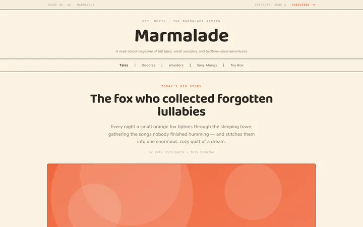
Illustrates children's-book warmth with bold outlines and saturated color.

Arcade
Presses chunky pixel buttons and rainbow shadows into arcade-cabinet fun.
More from @staqd
View profileEditorial Pack
Collects the editorial cluster — typography-led, content-first pages in one install.
Design Systems Pack
Bundles every aesthetic design system in one install — switch styles per project.
Fiction
Illustrates children's-book warmth with bold outlines and saturated color.
Arcade
Presses chunky pixel buttons and rainbow shadows into arcade-cabinet fun.